07
SPTrans
Mobility service design and app redesign
A conceptual redesign to transform the Bilhete Único app into a seamless digital wallet and an intuitive journey planner for São Paulo's commuters.
Context and challenge
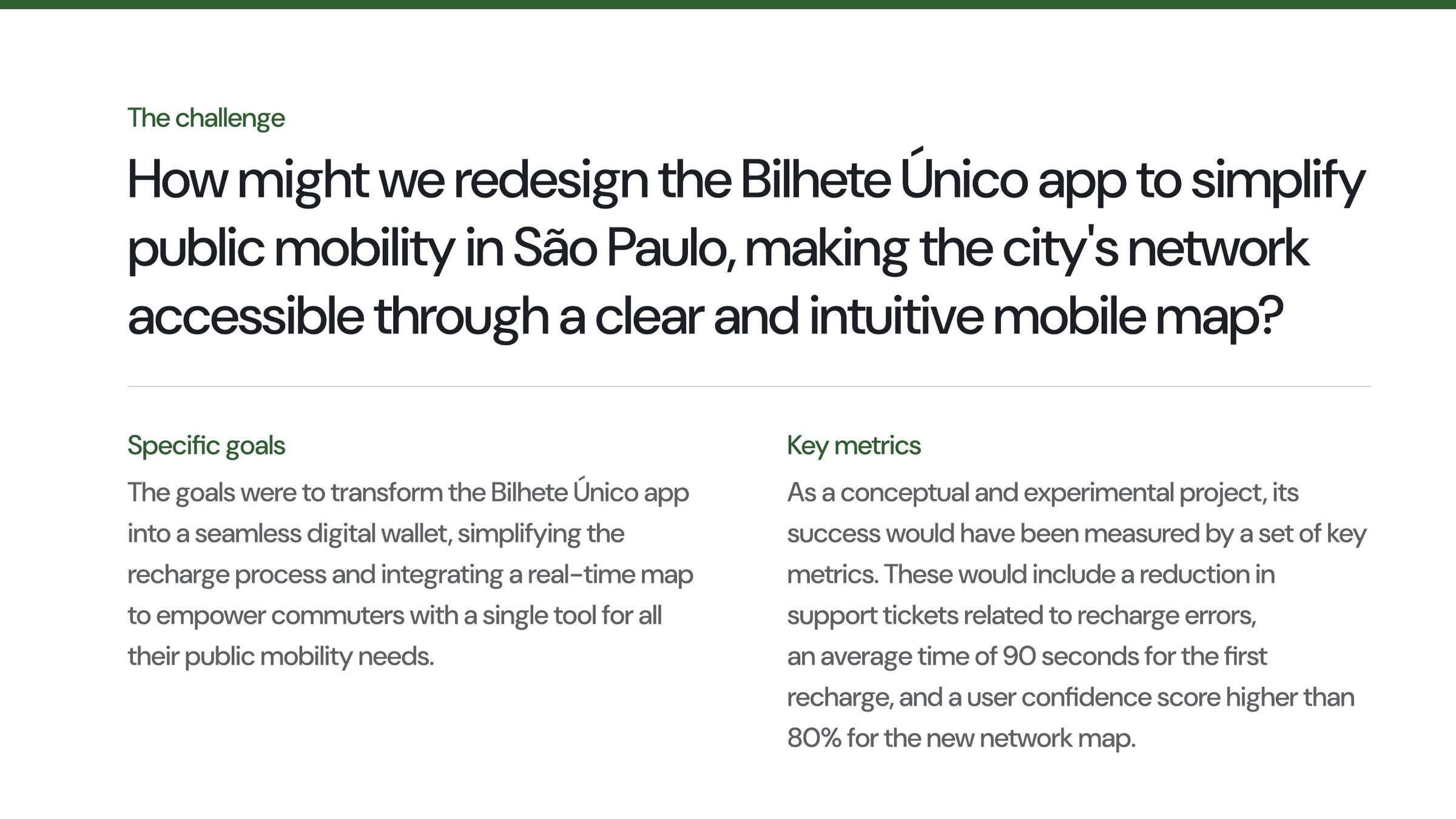
Public mobility in São Paulo is a network problem experienced as a series of small, high-stakes decisions: where to recharge, whether a balance is enough, which line to take, how to connect modes and whether the system is operating as expected. The Bilhete Único app had the opportunity to bring these needs together in one trusted place.
The challenge was to redesign the app so that the complexity of the network became easier to understand and act on. The product needed to be both a digital wallet and a practical companion for moving through the city.
Approach and process
The concept was framed around the commuter's full mobility journey rather than a single transaction. I organized the experience around the moments people need most: checking balance, recharging quickly, understanding transport status, finding a route and navigating the network with confidence.
The redesign used a map as the central information layer, translating the city's rail and metro network into a mobile interface that could support exploration and action. The service logic connected account, payment, balance, transport operations and route planning into one continuous journey.
Key design decisions
The experience was redesigned as a digital wallet first: balance and recharge became immediate, visible and easy to repeat. The home screen made the current state of the user's transport access legible, while shortcuts reduced the distance between intention and action.
The network map became more than a static reference. It was designed as a way to understand the city in motion, combining lines, stations, connections and operating status. A restrained visual language, clear transport icons and a focused navigation model helped reduce cognitive load without hiding the richness of the network.
Final experience and visuals
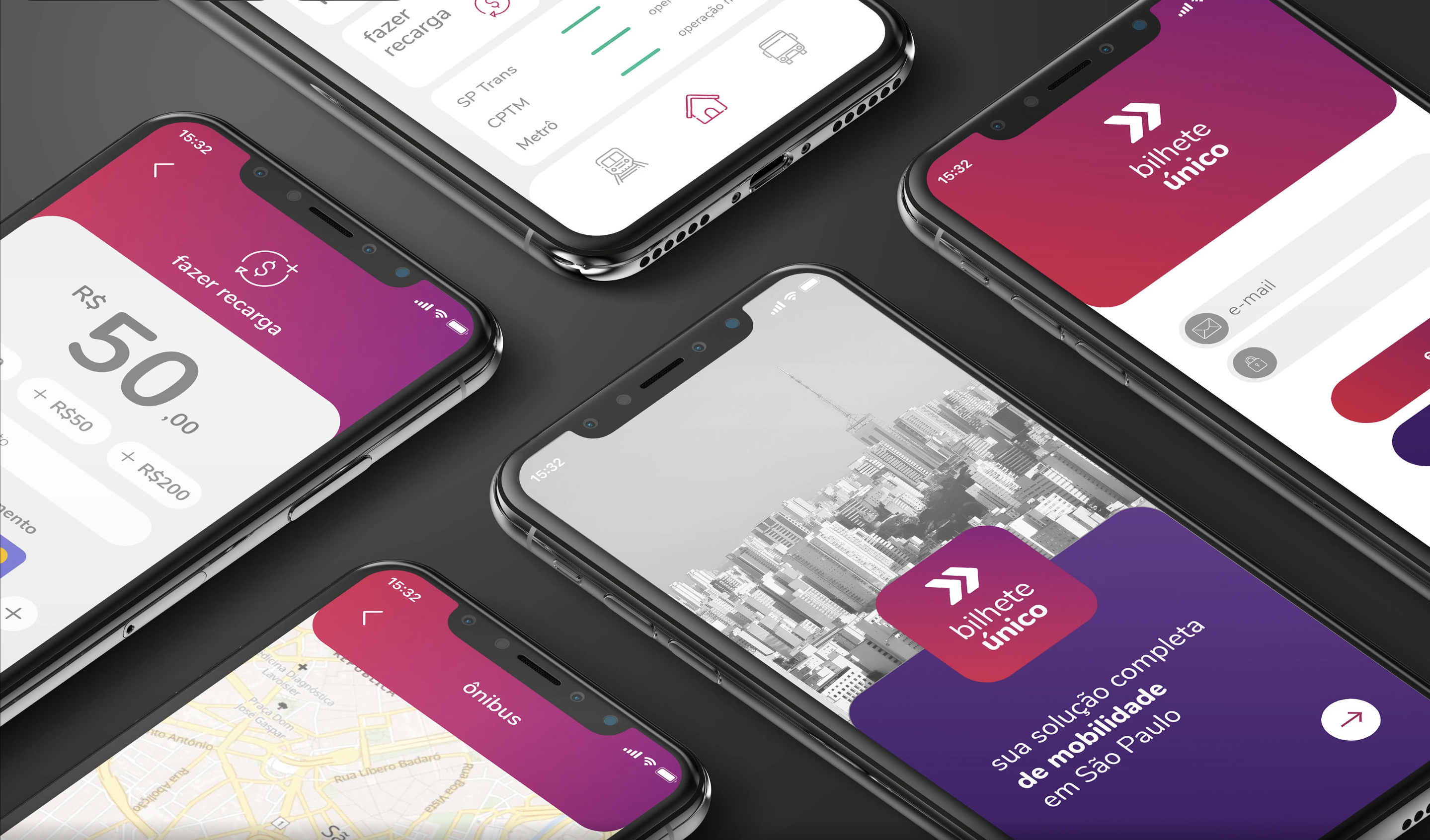
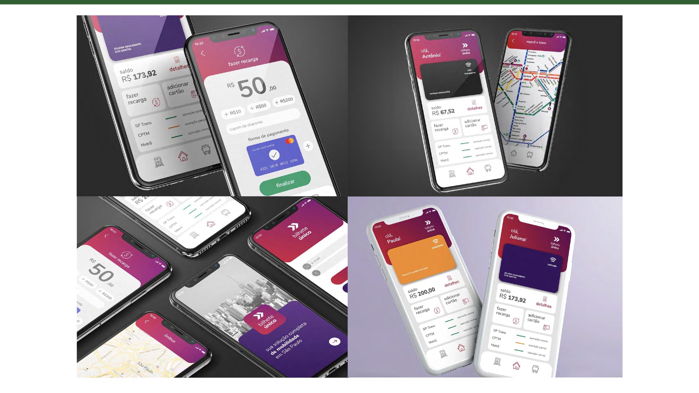
The interface system balances the institutional character of public transport with a more approachable mobile experience. Magenta and purple create a recognizable product layer, while white surfaces, route colors and compact status cues help users scan the information quickly.
The selected screens show the breadth of the concept: the wallet home, recharge flow, card details, operational status, route map and multi-device applications. Together they position Bilhete Único as a single tool for São Paulo's public mobility needs.
Outcomes and learnings
target average time for a first recharge
target user confidence score for the new network map
target reduction in support tickets related to recharge errors
As a conceptual and experimental project, success was defined through target measures rather than post-launch results: fewer support tickets related to recharge errors, an average time of 90 seconds for the first recharge, and a user confidence score above 80% for the new network map.
The larger outcome was a sharper product direction for mobility: treat payment, information and navigation as one connected service, giving commuters a clearer way to understand and move through the city.