05
Vapt
A design system for coherent digital products
Vapt needed a design foundation that could give a new digital product portfolio a recognizable voice and a reliable way to scale. I was responsible for translating the brand into a cohesive design language, building the system from its foundations, and applying it to the interfaces that brought the product to life.
Context and challenge
The challenge was to establish a cohesive brand and a scalable design system for Vapt from scratch, ensuring consistency across future products. The system needed to work across customer ordering screens, operational workflows and staff management dashboards, without treating each interface as a separate visual exercise.
The project sat between brand positioning and product delivery. It had to differentiate Vapt in a crowded restaurant and digital ordering landscape while giving product and engineering teams a practical foundation they could reuse.
Approach and process
The work began with a strategic brand positioning exercise and a comprehensive color study. I translated the emerging identity into a visual language that could remain expressive in communication and disciplined inside complex product interfaces.
From there, I structured the experience around the main user journeys and the relationships between restaurants, staff, customers, orders, menus and payments. The system evolved through information architecture, interface patterns, component definitions, iconography, states and responsive applications.
The goal was not only to create reusable components, but to create the rules that made reuse meaningful: hierarchy, spacing, color roles, typography, interaction feedback and the relationship between brand expression and operational clarity.
Key design decisions
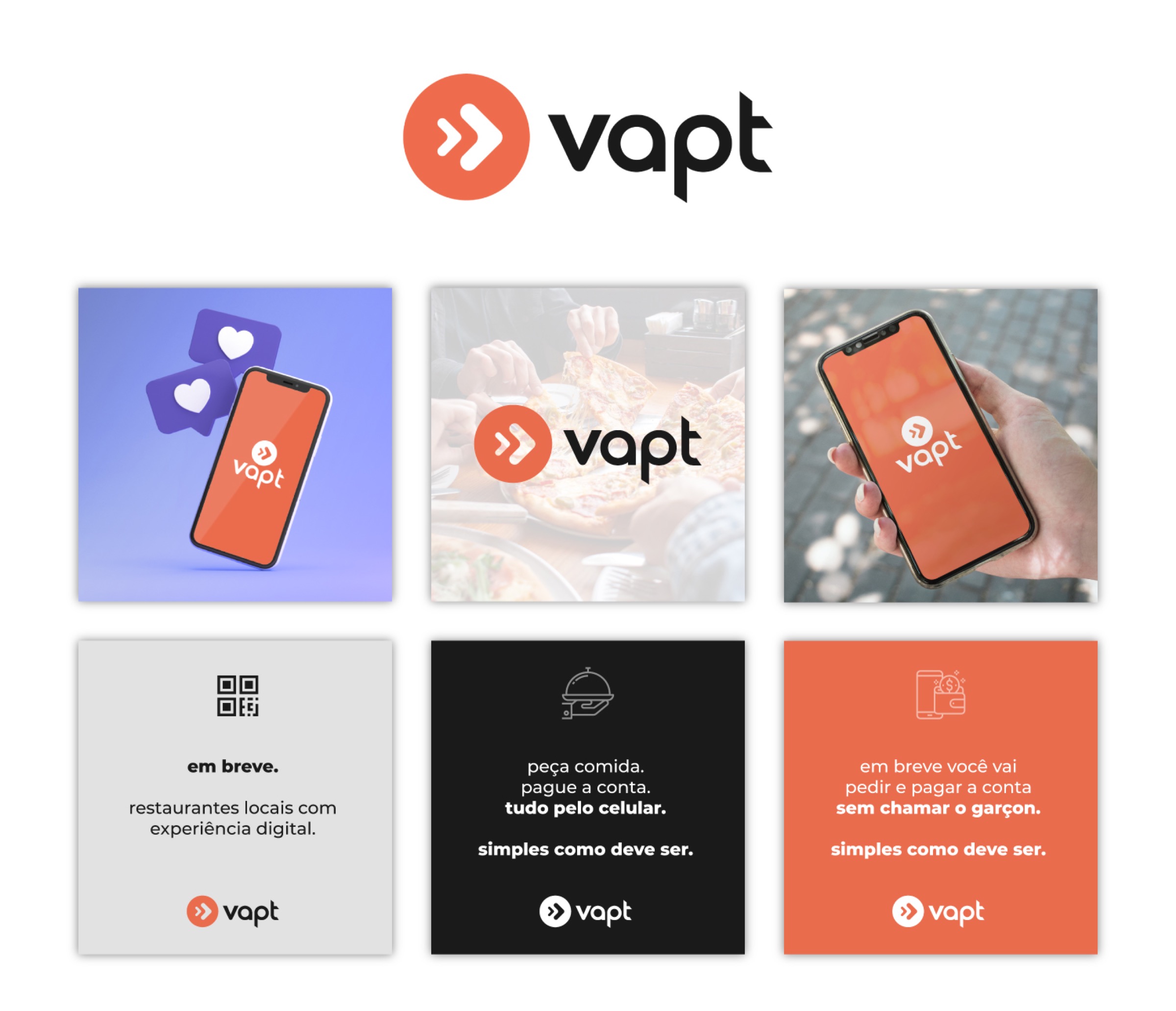
The visual system centered on a warm orange as the primary brand signal, supported by black, gray and purple roles that could separate action, structure, status and emphasis. This palette gave Vapt a recognizable personality while keeping interfaces legible and adaptable.
Iconography became another important bridge between brand and product. A dedicated set of restaurant, ordering, payment and operational icons helped the system communicate quickly without adding visual noise.
The component foundation was designed to travel across customer-facing ordering experiences and staff-facing management tools. The same principles could support a menu view, a product card, a dashboard state or an administrative workflow without making the experience feel fragmented.
Final experience and visuals
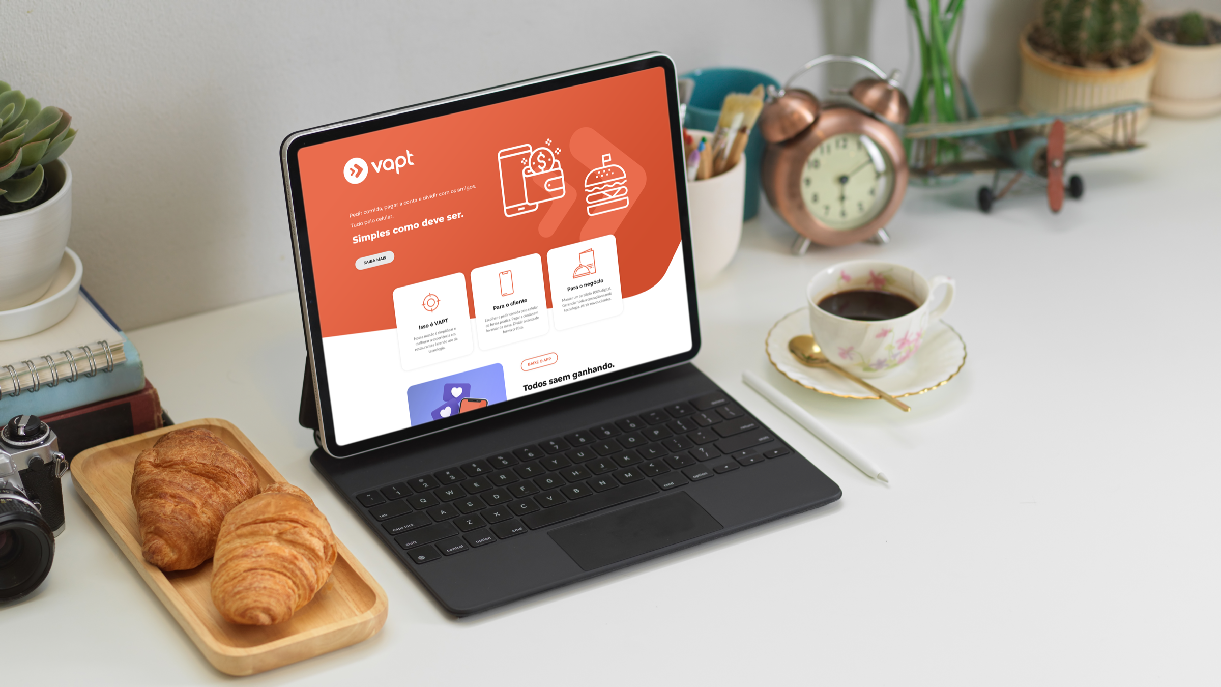
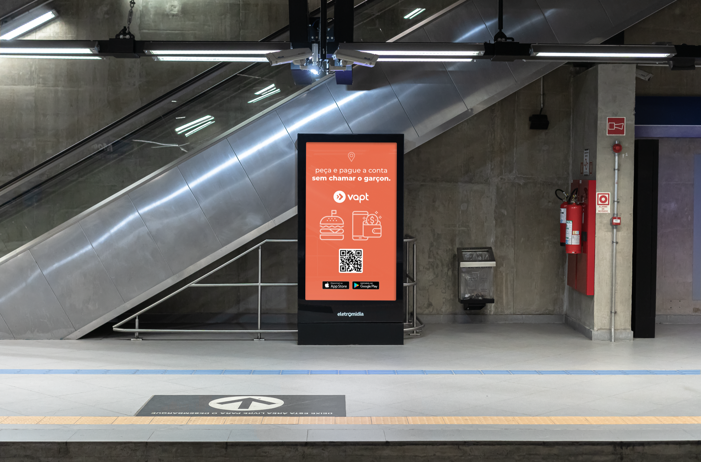
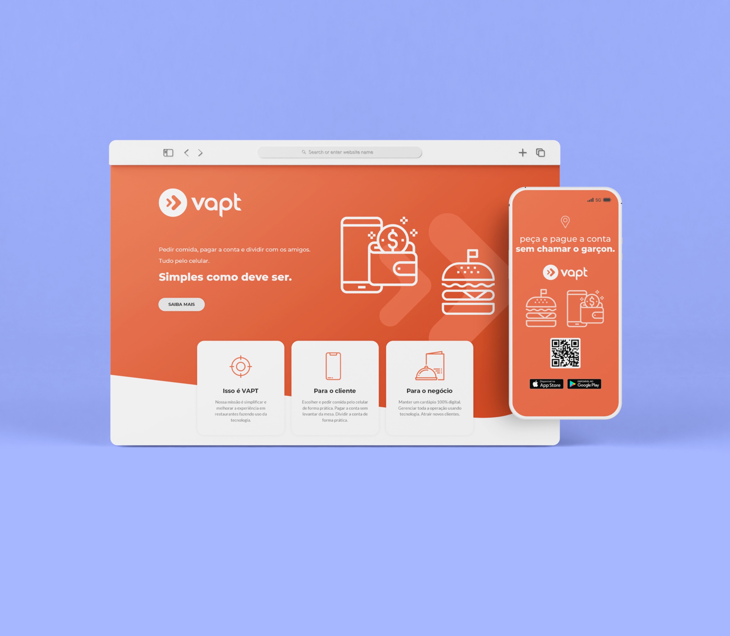
The selected artifacts show the system at different scales: the initial product framing, the challenge and success measures, the color and icon studies, and the first interface applications. Together they show how a design system moves from abstract principles to concrete product decisions.
The final direction connected Vapt's brand identity to a flexible digital toolkit: expressive enough for customer communication, structured enough for product delivery, and clear enough to support future interfaces as the portfolio expanded.
Outcomes and learnings
The outcome was a cohesive and unified design language for Vapt's new brand and future products. The design system became a single source of truth connecting identity, interface, components and product delivery.
Success was framed around Design System Adoption Rate, Component Reusability Rate and Design-to-Code Parity, with reduction in user errors as a direct signal of improved usability. More than a visual refresh, the work created a scalable framework that could accelerate development while preserving clarity and consistency.